ViLaXens
A warm, human-centered visual identity for a workplace mental health and coaching practice, communicating accessibility, trust, and transformation through design.

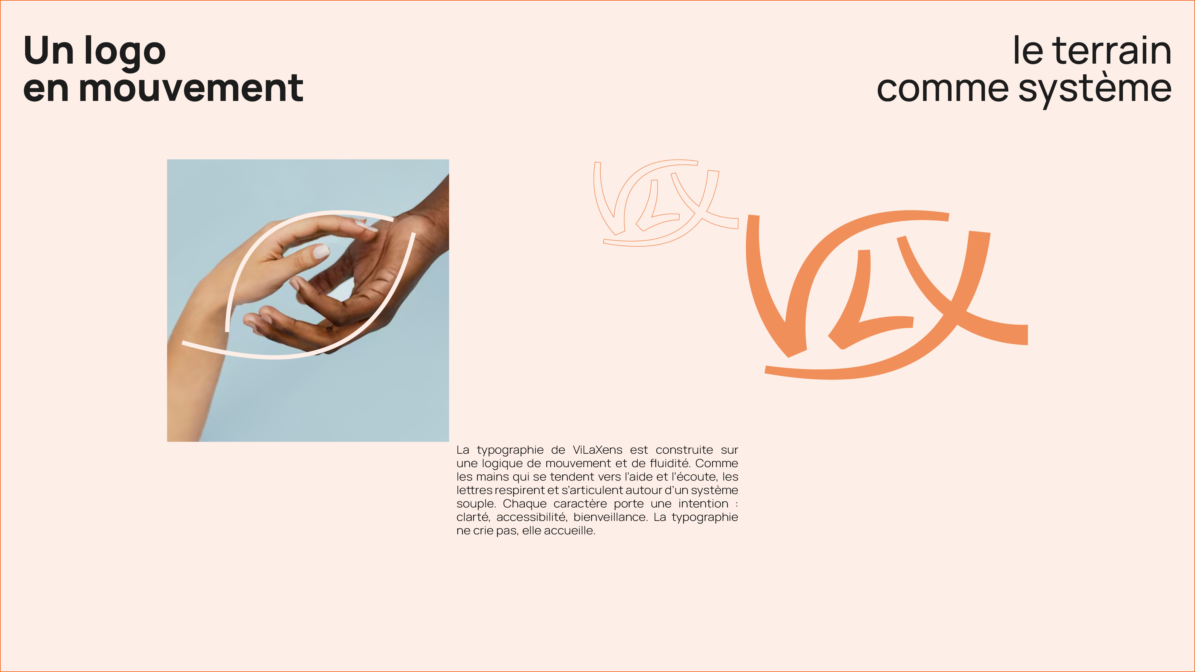
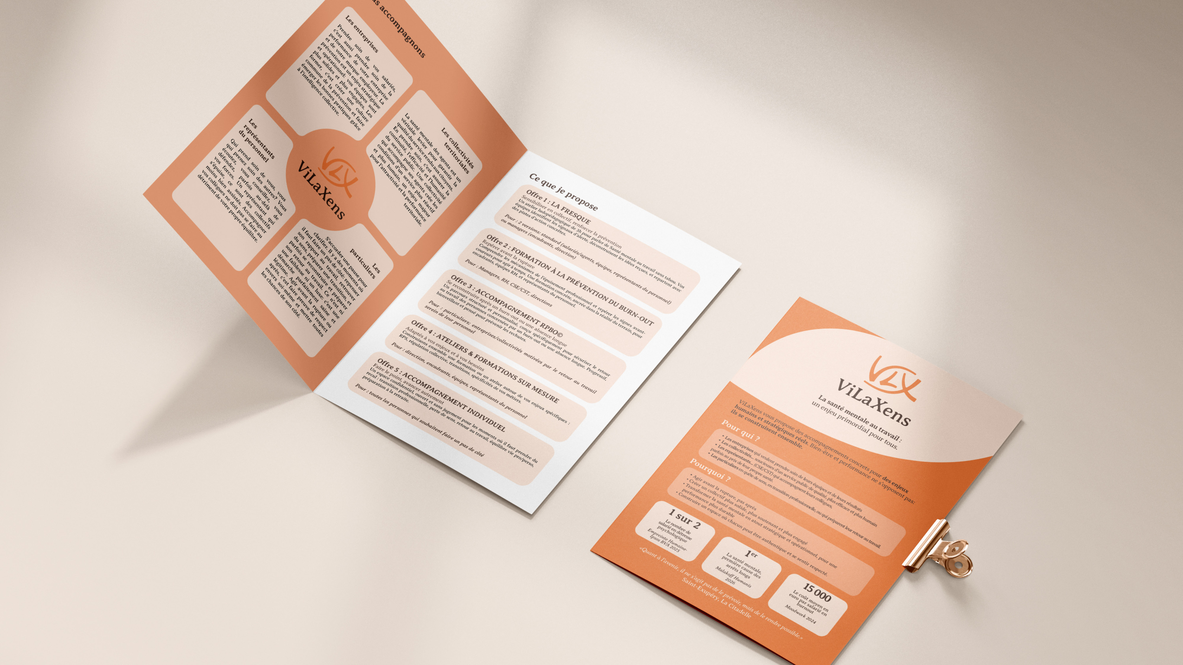
I developed a complete visual identity for ViLaXens, Virginie Labrousse's coaching and organizational consulting practice focused on workplace mental health and burnout prevention. The challenge: translate the deeply human, confidential nature of this work into a visual system that feels inviting and trustworthy while remaining professional.
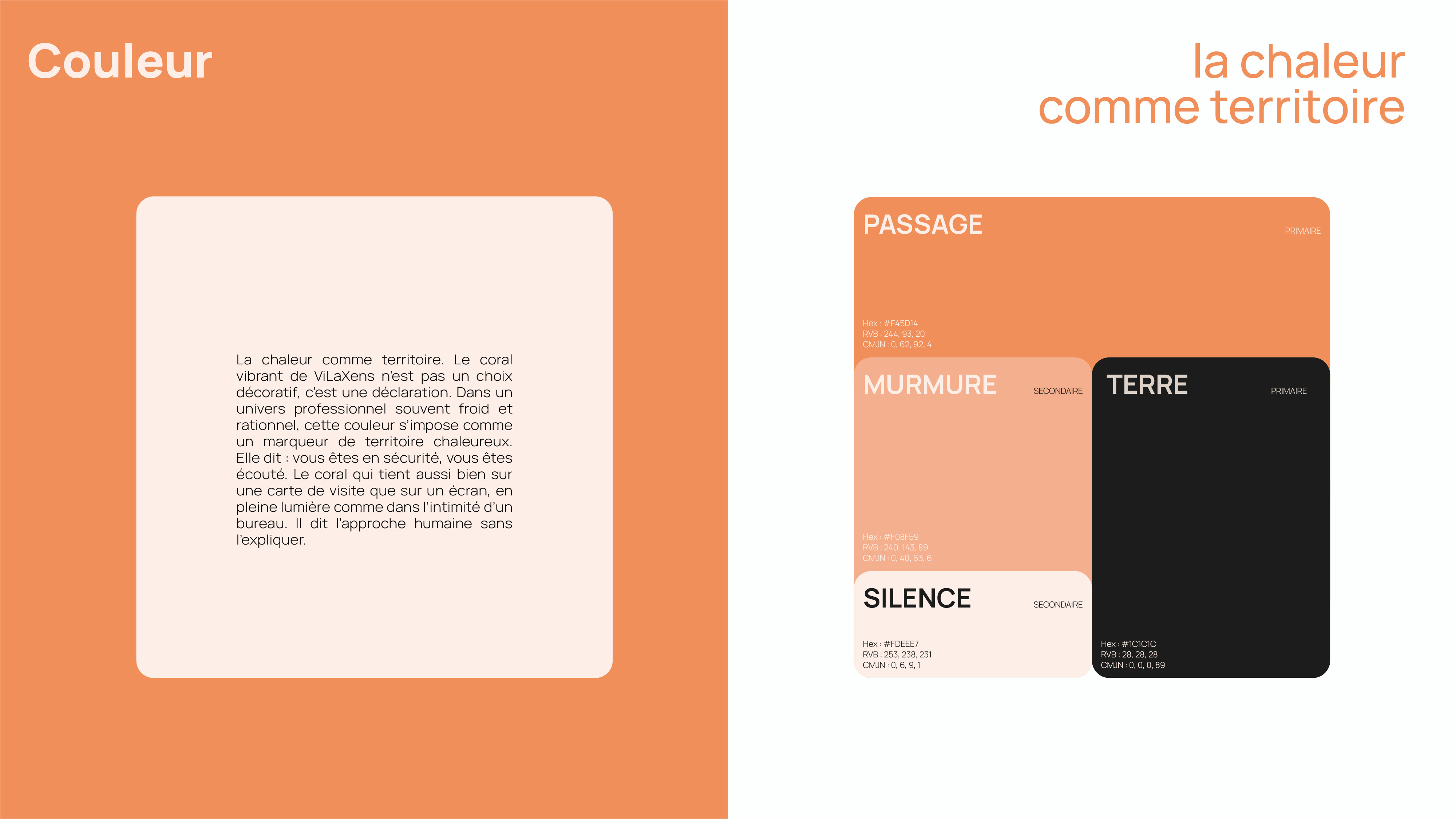
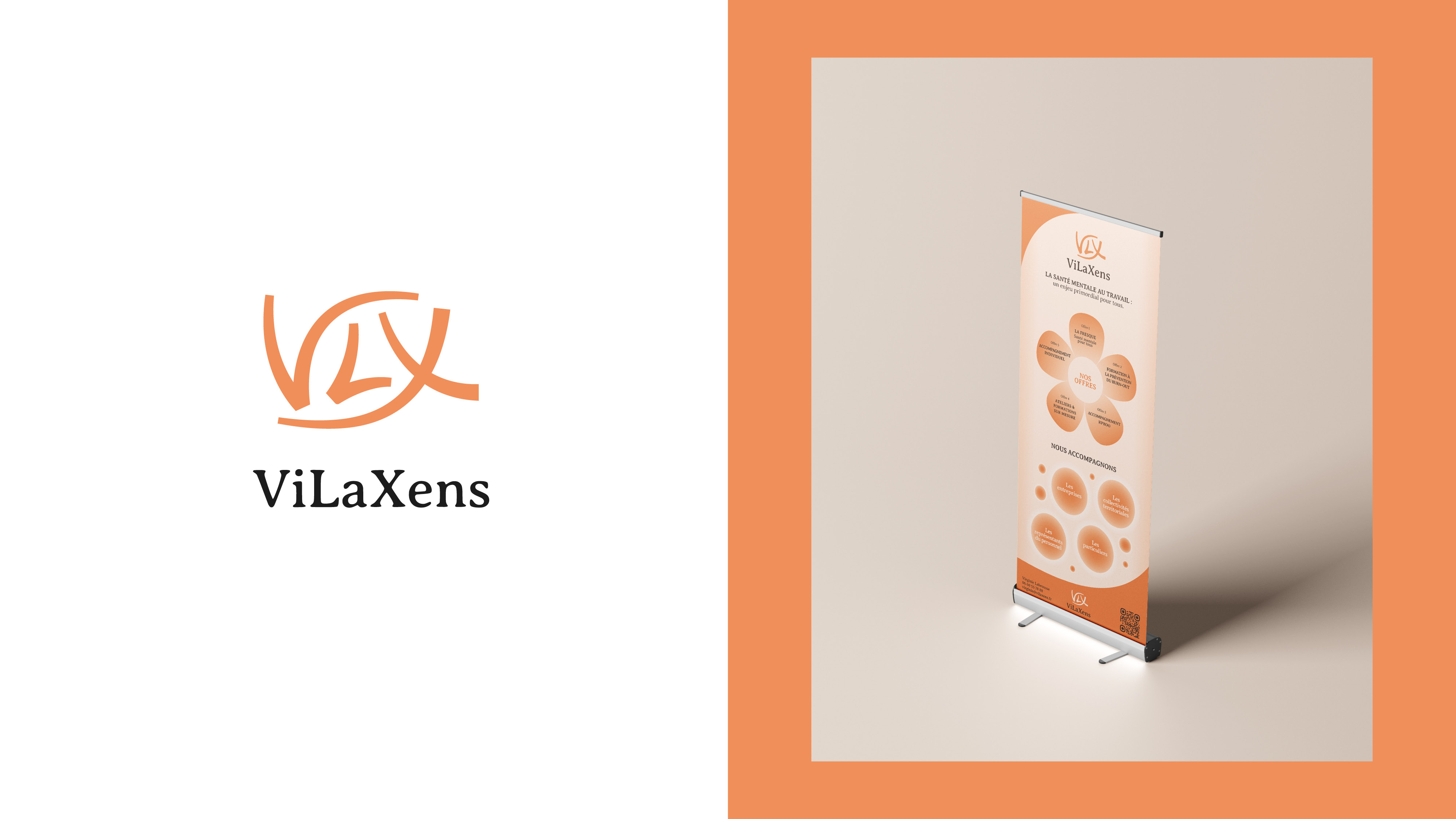
The identity centers on warmth and optimism. The dominant coral orange acts as a signal of approachability, a color that suggests both energy and comfort rather than clinical distance. The supporting palette of cream, soft pink, and charcoal creates breathing room, allowing the brand to feel human without sacrificing clarity.
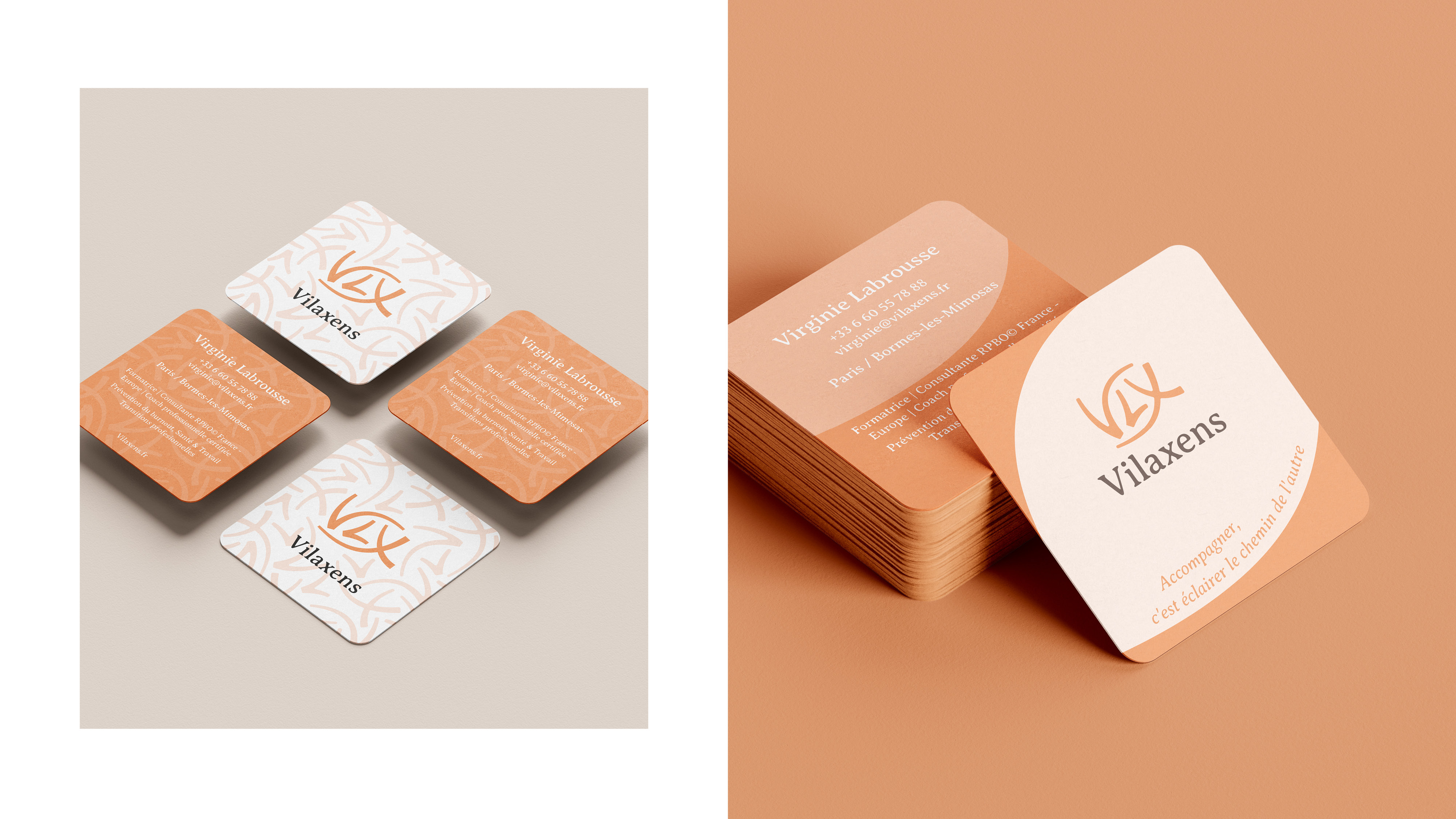
Typography and layout emphasize readability and accessibility. Information architecture is intuitive and never overwhelming, reflecting Virginie's own approach: structured methodology grounded in real-world application. The modular design system extends across business cards, kakémonos, presentations, and digital touchpoints, maintaining consistency while adapting to different communication contexts.
- Client
- ViLaXens
- Année
- 2026
- Secteur
- Coaching / Mental health & wellbeing
- Discipline
- Branding, visual identity